NASA’s Logo: The Meatball vs. The Worm
03.03.22
- Brand
- Insights
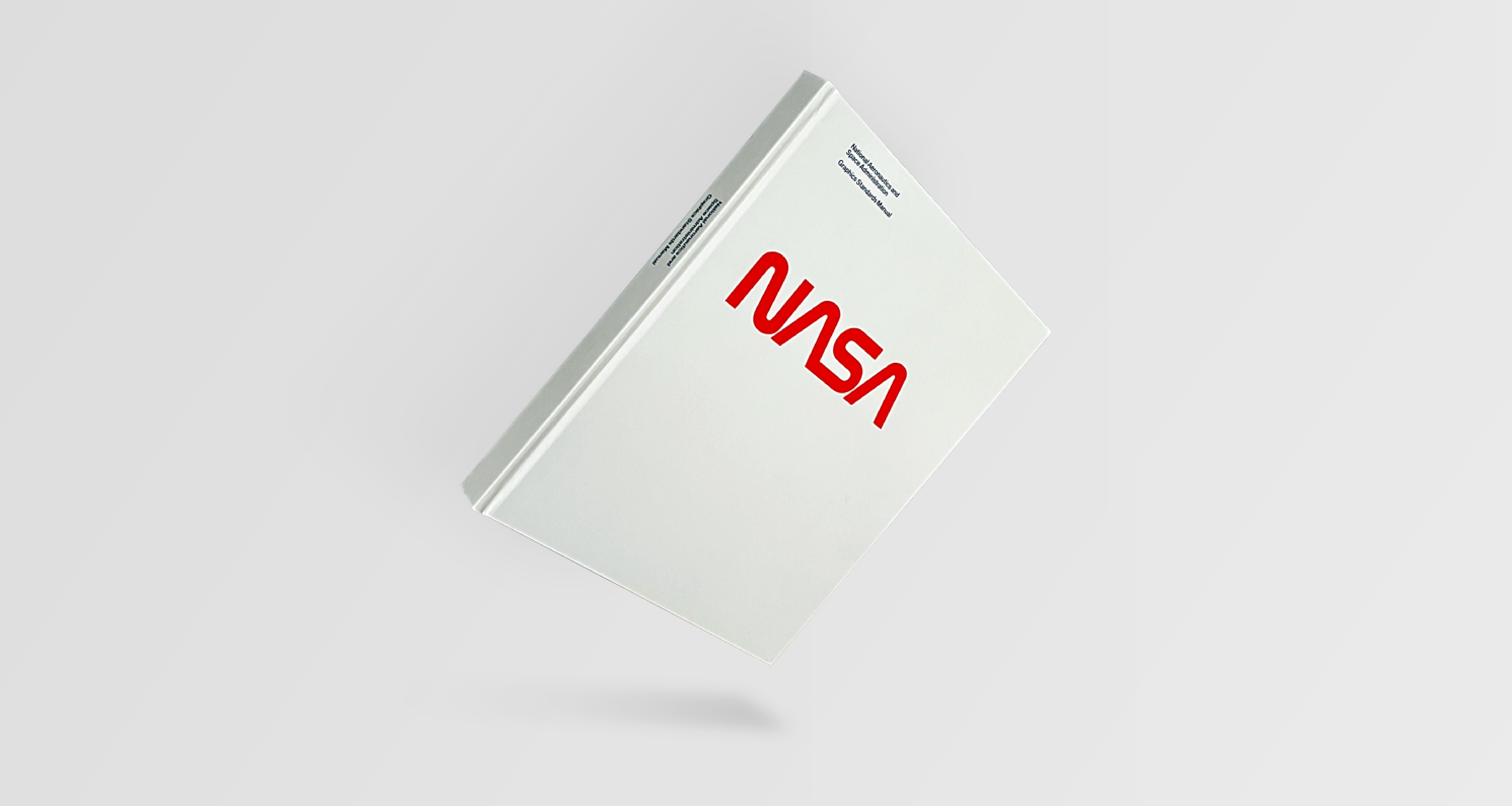
You could quite literally say that NASA’s logo is out of this world. Literally.
The National Aeronautics and Space Administration has been responsible for civilian space programmes, aeronautics, and space research, since its launch in 1958. But, how does a global administration summarise such expertise to the world? How does the everyday human even begin to fathom NASA’s work?
Well, it’s a small step for a logo, but a giant leap for semantics. So, buckle up – we’re launching off into the analysis of NASA’s two iconic logos and what they meant for NASA’s representation to the public. We’ll call this mission: Meatball vs. Worm.
3…
2…
1…
(you know the drill).
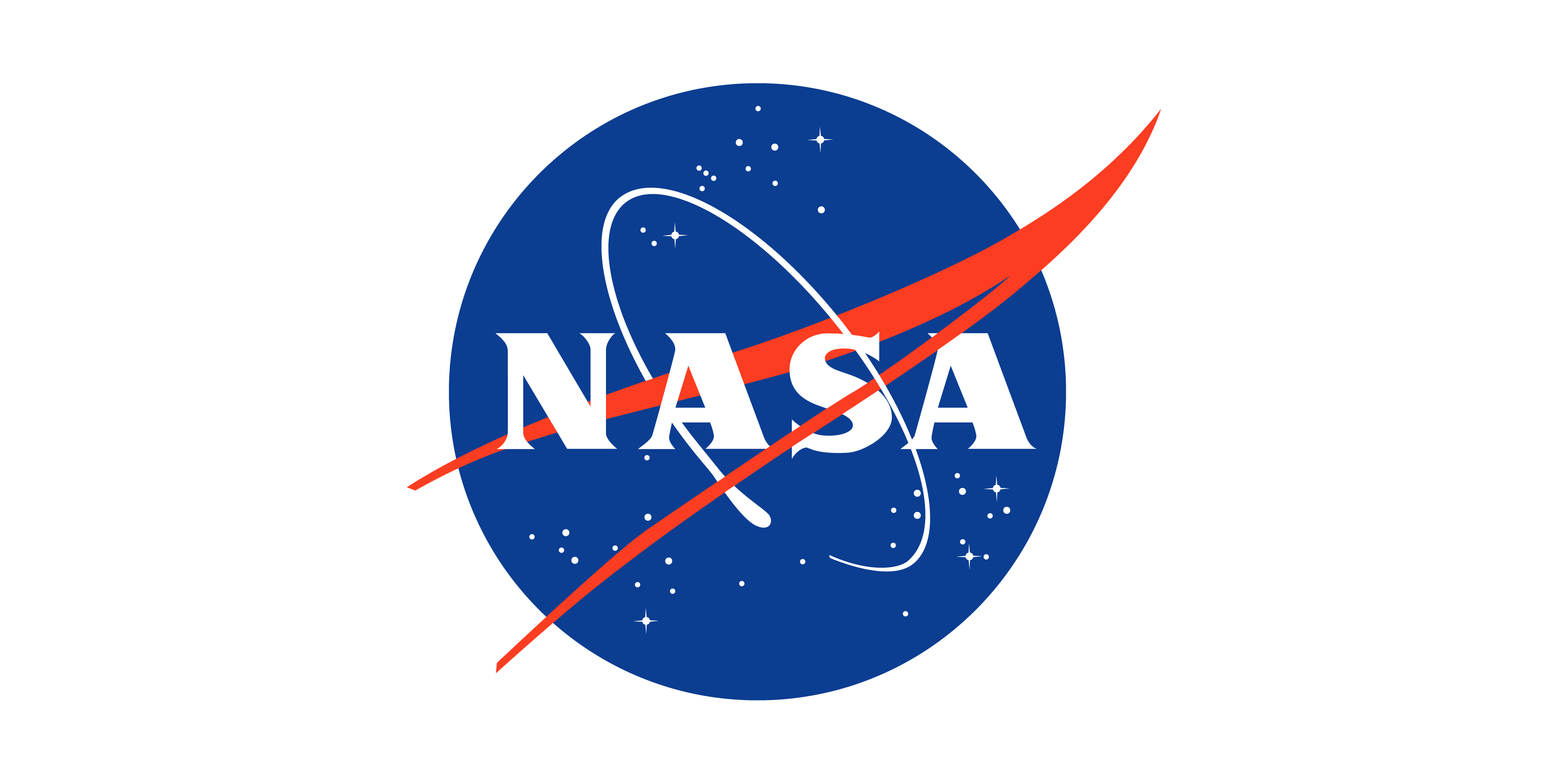
The Meatball (1958-1975, 1992 – Present), by James Modarelli
This image may seem a bit familiar to you.
Not only because it is NASA’s current logo, but because the design was initially based off the Agency’s official seal (or insignia, if you want to be fancy about it). Albeit, both were designed by Modarelli, but he was tasked with the brief to ‘simplify’ the seal from NASA’s administrator, Thomas Glennan.
Why the name Meatball, you may ask? Well, it was adopted by those at NASA to give the logo a more ‘modern’ feel. Modern, not so sure – but definitely memorable.
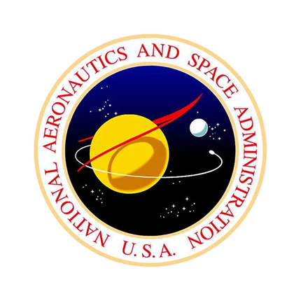
The seal was just a tad too formal.
It wasn’t accessible to the everyday public – would people be behind a movement that looks so daunting, visually? Today, the seal is rarely used outside of NASA’s Headquarters and is only used for internal communication purposes. What we know today is Modarelli’s instantly-recognisable meatball, so to speak.
Despite being called ‘a design nightmare’ by Greg Patt, publishing contractor of NASA, The Meatball genuinely has credible substance, much to the opinion of others.
Especially in terms of the logo’s societal effect – compared to the seal, The Meatball is its friendlier sibling. It’s just a lot easier to swallow, if you’ll pardon the pun.
It’s worth noting that NASA’s logos is one of the most controversial topics within the whole industry – each logo held its own power and meaning, and with it followed a design divide. It was found that this divide was generational, too. Modarelli’s Meatball spoke to the older generations, due to its grounding in tradition and origin.
The Meatball’s pantone 286 blue sphere suggests the combination of Earth in harmony with other planets, scattered with stars of white, belted with the letters ‘NASA’, embellished with a flowing red chevron.
It may sound a bit like an M&S advert, but it shows that Modarelli transformed the seal into something tangible for the general public.
It’s all in the details. Moderelli was sure to recognise the importance of NASA’s origins through keeping the red chevron present. Christopher Bananos noted the popularity of the chevron shape in his essay, ‘Are You Team Meatball, or Team Worm?’ (excellent essay title, if I may add).
‘Streamlined boomerang shapes like this were propagating throughout American design…Literally, and figuratively, sonic booms were in the air’
Christopher Bananos
And thus, the delta wing remained firmly in place.
The Meatball was iconic in the way it is a literal depiction of the agency’s mission.‘It was a boy adventurer’s idea of space travel’ said Bonanos, ‘it spoke to them’.
Modarelli literally brought the idea and the possibility of space travel down to Earth, to the general public, through graphic design.
Take the colour blue, add space, sprinkle some stars and draw a trendy chevron – it is quite literally the perfect recipe for a Space Administration agency cake. At this point, you’d think that NASA’s mission couldn’t be made any clearer.
And then came The Worm.

‘The Worm’ (1975-1992), by Danne and Blackburn
By 1972, NASA had come under scrutiny, and processes were at a bit of a low to say the least. For the first time in history, the agency was being asked to justify itself by the masses.
With a growing budget and the lives of three astronauts threatened in the Apollo 13 mission, people were starting to wonder whether NASA should attempt to fix problems on Earth before trying to tackle the nether.
Amongst the uproar, the graphic design industry had actually seen a huge increase in attention and recognition. Big corporations started to see the long-term effect on good graphics, and thus a strong graphic identity. With great graphics comes great power, eh?
To combat this, Nancy Hanks launched the Federal Design Improvement Program, allowing grants for government departments to hire designers to develop ‘a graphic identity program’, to ‘convey modernity rather than stodginess’ within their industry.
If there were a word to describe NASA at this point in time, it would definitely be stodgy, unmoving. It was time for designers to step up to the sky-high expectations and get the ball rolling for NASA, once again.
The brief: To come up with a logo that would speak to NASA’s future rather than its past. To get people to believe in NASA once more. To unify NASA’s eleven centres.
A huge task. An ethereal task. But one that Danne and Blackburn never shied away from.
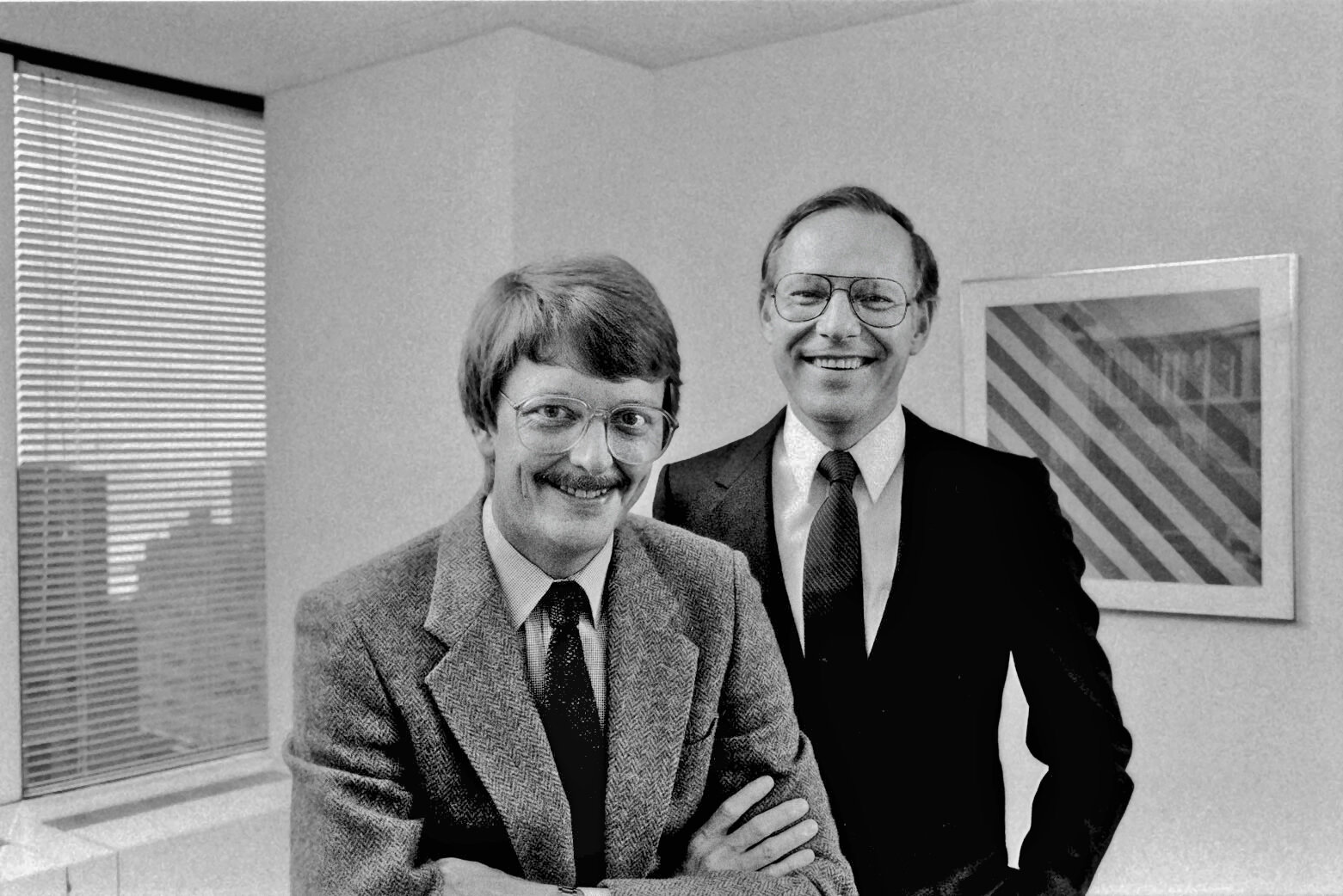
Despite being a small company of three, Danne and Blackburn won over the minds of NASA big-shots with The Worm.
It was a hard bargain, but one that paid off greatly for their small design agency. In 1985, they were honoured with a U.S Presidential award for Design Excellence. But what makes The Worm so iconic?
Commenting on the design brief, Danne and Blackburn realised ‘that with so much chaos, we needed something terribly simple to anchor our program’. The philosophy of Occam’s Razor can be applied wonderfully here – sometimes, simplicity conveys the complex in the most effective way.
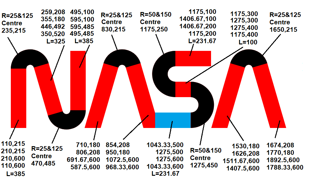
The Worm is embodied by three compound curve lines, each with a single-width stroke. Coloured in pantone 179, the NASA Red nods to the delta wing colour from the early insignia, and The Meatball.
Straying away from the typical aeronautical theme of blue from the skies and the sea, they chose the colour of red. Action. Heat. Determination.
The A’s purposefully lack a crossbar to represent an elevation, or shock waves, alluding to the rapid, forward-thinking nature of NASA as an agency. It reduces NASA to its simplest form, because that’s all it needs to be. Danne and Blackburn speak directly through the design, literally stating that NASA is enough. The letters are enough. It holds its own power.
If you read between the lines, there’s unshakeable history.
The Return of The Meatball (1992 – Present)
And so the controversy ensues…and The Meatball returns. The Meatball is iconic in its own right and in what it stands for, but – The Worm has my heart. Its simplicity speaks to me. Maybe Danne and Blackburn were way ahead of their time in that sense.
By 1990, post-Challenger disaster, NASA needed a morale boost. A fresh lick of paint to follow four years of mourning. What better way to boost morale than revamping NASA’s very identity – its logo. The very embodiment of NASA’s brand mission and values.
‘If you really want to excite NASA employees about changes coming, why don’t you tell them we’re going to de-worm NASA and bring back The Meatball?’
These are the very words said to NASA Administrator, Daniel Goldin, before he brought The Meatball back into circulation.
So shall it be written, so shall it be done – and The Meatball has now been NASA’s official logo since 1992. Don’t worry – if you’re gutted about it, just think about this…
There is something undeniably warm and nostalgic about The Meatball. It tells a historical story, and provides cyclical continuity. It will always have a place in the NASA graphics universe even if we agree with it’s comeback or not.
Now, whether or not it’s better than The Worm from a design standpoint is an argument for another day, and one that only you can decide for yourself.

